Monday, 13 December 2010

Construction - Images

In order to edit my images and make them more suitable for my magazine i opened them into 'Microsoft Office 2010' and began to make changes to the image. I started by changing the brightness of the image as seen below i made it brighter:
For this image i then decided that it would add more variety if i put it into black and white as it would add more variety:

After adjusting the contrast, opening it up in photoshop to make sure all shadows were covereed up and repeating this with my other images i now have 4 edited images ready for my magazine. I decided to make a few changes to my choice of picture. I also took a long shot picture of emily which i plan to use on my double page spread. These are my final 4 manipulated images:


Tuesday, 7 December 2010

Planning - Preperation for Production

Colour Scheme
The colour scheme for my magazine will be red, white, a dark blue and a baby blue. I plan for the title of the front cover to be in a draker blue with the sell lines in red and baby blue. The background of the magazine will be left white to make the image stand out more. The contents page will also share the same blue title with the text for the features being in baby blue and red. The editors letter however will be written in black to make it stand out more for the reader so that they are more likely to read it. I plan for the title of the double page spread to be written in the same colour as the other titles. Once again the writing for the interview shall be in two different colours. The questions asked by the interviewer will be in baby blue and the answers given by the artist will be in black so that the reader can distinguish between the two.
Layout
The front cover will contain a large mid-shot image of a female artist who will have direct eye-contact with the camera to draw the reader in. The masthead will be placed abover her head with the tagline beneath it aligned to the left. The sell lines will follow down the page on either side of the image with a thumbnail image being present in the bottom left. Since my plans i have also added an advertising banner which will go diagonally across the bottom right corner of the page, i have not yet decided on the colour this will be. The date and the barcode will be held nearer to the top of the page on either the right or the left hand side.
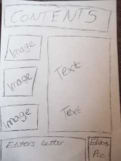
My contents page will have the features included within the magazine listed down either side of the images which i plan to have three of (one of the main artist from the front and 2 others). I have decided on very few changes to my contents page since my computer draft.
The double page spread has once again had very few changed to it since my computer drafts however i have decided to change the layout slightly by removing one image and adding in more text to allow for more content.
Content
I plan for my front cover to contain sell lines on live events and Indie acts and music which will be of interest to my target audience. My contents page will go into more detail about the sell lines explained on the front. It will also include futher articles which will be shown inside. They will include other Indie related topics and things such as music news. My double page spread will have a light-hearted tone and be an interview with a successful young singer who is soon to be releasing her debut album.
Images
For the main artist of my magazine (the artist on the front cover and the double page spread) i have planned to photograph my friend Emily, she is 17 which is the same age as my target audience. I have already prepared and chosen three of the pictures i plan to use of her, i have left them unmanipulated and plan to edit them soon.

I have used a variety of shot types, i included a mid-shot and a close up in order to add variety to my magazine.

Saturday, 27 November 2010

Planning - Computer Drafts

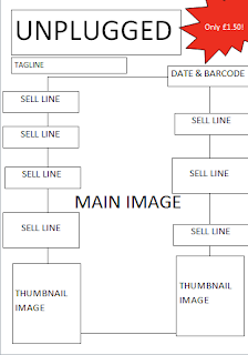
My pencil drafts gave me a rough idea of how i wanted to layout my final product however after going back over the codes and conventions of each page i decided to make a few changes to fit more with my idea of a good music magazine. I made quite a significant change to the contents page and changed the layout to adding the images into the middle and allowing more space for the text. I have inserted my computer drafts below:


Tuesday, 2 November 2010

Planning - Pencil Drafts

After putting together a list of the codes and conventions i put together a pencil draft of my front cover, contents page and double page spread. On these drafts i drew out the positioning of the images and text on my pages. I also decided on the name of my magazine which is 'Unplugged'. I decided upon this name as it fits in with my 'Indie' theme, it suggests that you can hear the artists behind the technology and see them as they are. Also it reinforces the idea that the magazine includes the Indie genre of music as 'Unplugges' suggests that the music within is live and acoustic which is what my readers are interested in. Now that i have drawn out where i would like to position everything i can make another draft on the computer which i can add more detail to. 


Sunday, 17 October 2010

Planning - Reader Profile


I have put together a mood board for my target audience which shows all the things that they enjoy. I have chosen my target audience as being a mostly female audience from the ages of about 14-18 years. My target reader is a keen music listener and she enjoys listening to Indie artists such as Ellie Goulding and Joshua Radin. She also enjoys playing the acoustic guitar and playing her own music and when she can afford it enjoys to go to live music festivals. Along with her interest in music she also has a keen interest in fashion and photography and her favourite season of all is the summer as that is when most of the live music events happen.

Tuesday, 12 October 2010

Research - Audience Questionnaire

I put together a questionnaire to find out if people would be interested in a music magazine and if so what would they like to see inside it and also what images and colours would draw their attention most. This are the results i gathered:

1)      Would you be interested in reading a music magazine?


2)      How much would you be willing to pay?


3)      What genre of music would you like you like the magazine to cover? (picks as many as you would like) People chose more than 1 genre

R&B – 10                         Pop – 10                 Heavy Metal – 2
Dance – 9                        Country – 1           Hip hop – 8
Rock – 4                           Indie – 8                Rap – 4

4)      What would you name the magazine?

Music madness                             Music Mayhem                               Rockstar
Unplugged                                     Music Magazine                              Listen
New Music                                     Beatz                                           Turn it up
Signed                                          Ro Jaro                                         Musik Rox
Ultimate Dance                             Country Life                                   


5)      Would you like a male or female artist on the cover?
6)      Band or solo artist on the front?

7)      Prefered Colour Scheme? People chose 2-3 colours.
·         Bright pink and white                                            Black, White and Grey
·         Dark blue, teal and white                                     Blue and White
·         Gold, black and silver                                            Red and black
·         Grey, Green and blue                                            Black and dark pink
·         Black, white and red                                              Black and white
·         Dark blue, white and red                                      Pink, grey and black
·         Yellow and orange.
8)      What type of article would grab your attention?
·         Music Reviews                Interviews with unknown artists
·         Interviews                       Festival reviews
·         New music releases      Popstar news

9)      What sort of articles would NOT interest you?
·         Unknown bands                             Music critics
·         Old music                                        Music stats

10)  Would you prefer articles on older or newer music?

11)  Would you prefer the language to be sophisticated and formal or informal or casual?

12)  How frequently would you like it to be published?


13)  What props (if any) would you like to see in the main image?
·         Strobelights                                             Musical instruments
·         Microphone                                            Drums
·         None                                                        Guitar

14)  Do you read the editors letter?
15)  If not what would make you read it?
·         Informal language
·         Addressing the reader
·         Talking about interesting topics
·         Nothing

Saturday, 9 October 2010

Research - Codes and Conventions of a Double Page Spread

I gathered together a list of codes and conventions after looking at already exisiting double page spreads and i found the following:

  • The language used is light-hearted and chatty to engage the reader.
  • The text is layed out in columns to make it easy to follow.
  • There is a main image which is large and of good quality.
  • In the main image the artist has eye contact with the camera.
  • There are sometimes other images on the page of the artists but are smaller and from different distances (long shots, mid shots or close ups)
  • The main title will have an exciting, engaging word/phrase such as 'Exclusive Interview!'
  • Contains information about the artists upcoming tour or album release - rarely both.
  • Normally the artist interviewed has been recently successful in the music chart.
  • Same colour scheme followed as on the front cover and contents page.

Friday, 8 October 2010

Research - Double Page Spread


I also looked at the double page spreads of some well-known music magazines. This one is out of the magazine Kerrang. It can be seen from the nature of the images and the red,white and back colour scheme that it is made to appeal to an older maybe more male audience. There is a significant amount of text on the pages which is layed out into columns to make it easier for the reader to follow. It also once again reflects that older target audience as they would be more inclined to read large amounts of text. The main title for the interview is a quote from the band themselves which would draw in the audience and make them more interested in reading further on. There is one main, large image of one artist in the band which at the bottom of it also has three thumbnails laid out below it to make the feature more exciting and appealing. It is also stated to be a 'World Exclusive' interview making the potential reader more inclined to reading it as they believe this is the only place they will be able to read something like this.


This double page spread is an onterview with Lady Gaga taken from Q magazine. As we can see once again the main image is large and takes up the whole of the first page, it is in black and white which makes us see that it is for a more mature audience. As the above double page spread this one also has the text laid out in columns making it easy to read and understand. Chatty, light-hearted language is used throughout both interviews which will keep the target audience engaged and make it more enjoyable for them. The double page spread also follows the same colour scheme as the other pages within the magazine which allows me to see that i too must follow a continual colour scheme throughout.  

Thursday, 7 October 2010

Research - Codes and Conventions of a Contents Page

Once i had looked at the contents page of other music magazines i then drew up a list of codes and conventions:

Layout
  • The editor’s letter is separate from other text with a conversational tone.
  • The text is split into categories with the subheadings contained in boxes.
  • The logo of the magazine is usually displayed and is prominent.

Type of images
  • One large main image of the main act is displayed
  • Not too overwhelming
  • About 3 thumbnails
  • Some close up headshots and a full body image.

Style of language
  • Young/modern
  • Use of 2nd person ‘you’ collective pronoun ‘we’ involves the reader.

Mise en Scene
  • Big clear images
  • Bold subheadings
  • Readable font

Research - Contents Page

I have also carried out research to ensure that when i create my contents page it will fit with other successful music magazines. In order to do this I researched other contents pages and looked at how they attracted their target audience. I looked at the contents page for Kerrang and found that all the features were listed under subheadings with the page numbers being bold and big so that they stand out for the reader. This contents page contains many images which will be of interest to the reader. It is set out neatly in columns and boxes to make it easy to read. There is an editors letter in the top right which is in smaller print and therefore leaves more space for the features to be listed. They follow a consistant colour scheme of yellow, black and white throughtout and the features are kept within the genre of music which interests the target audience. In this case the genre of interest is rock music.


I also looked at the contents page of Q magazine and found that it too had a similar layout. The features were all set out under sub headings. The page numbers were once again made to stand out off the page and catch the readers attention. On this contents page there are only two image. This is useful as it draws attention directly to that image and therefore to the story of which the editors will believe would be of main interest. Along with the large umage the text for this feature is also larger than the rest once again drawing attention to it. There is also a colour scheme of red, white and black which is followed. The magazine contents page reflects the target audience of an older generation as the font used is sophisticated at the layout is kept simple and consistent.

Tuesday, 5 October 2010

Research - Codes and Conventions of a Front Cover

After looking at already punlished music magazines i have drawn up a list of the codes and conventions found on the front cover of a music magazine:

·         Quite busy – many sell lines.
·         Large bold, sometimes brightly coloured masthead.
·         Normally a well known artist featured on the cover.
·         The artist on the cover is normally the focus of the main story inside.
·         Set target audience. Just by looking at the house style we know who the magazine is aimed at.
·         Eye level of image is about a third of the way down the page.
·         Relevant topics for the target audience.
·         Eye-catching, makes the reader want to buy it.
·         Consistent colour scheme making it recognisable to the audience.
·         Vital information such as price and date of issue displayed.
·         The text is clear and visible, easy to read.
·         The image is of good quality, it is not pixelated or blurry.

Research - Front Cover

In order to make sure that my magazine would be suitable i have carried out some research into sucssesful music magazines such as this issue of NME. The cover of this issue shows just one memeber of the band 'My Chemical Romance'. This reflects the target audience as being major music fans as they do not need the other members of the band suggesting that the audience would identify the band from just the one artist. The artist on the cover has eye contact with the camera and has a quite a stern almost sinister look about him. This reflects the target audience as being an older generation as smaller children would not find this appealing. The sell lines shown include names such as 'Damon Albarn' who was once from an alternative rock band, 'Pete Doherty' who is an indie artist and also 'Foals' who are an indie rock band. This suggests that the target audience for the magazine are people who have a keen intrest in indie, rock and alternative music. The colours used for the title and the background are very neutral and allow the artists vibrant red hair to stand out suggesting that the target audience may also be people who wish to stand out from the crowd.Also with the hair colour standing out it makes the magazine itself stand out and therefore more likely to sell well.

I also looked at another magazine front cover. I looked at Q magazine which featured Lady Gaga, Jay Z and Dave Grohl. Each of these artists are part of a different genre of music implying to us that the target audience is a music fan who is interested in all genre's. The words 'exciting people' stand out for us suggesting that the magazine will be enjoyable to read and will therefore attract the audience's attention. The names of the artists on the front cover are printed in a large font beside them to draw in the target audience. Once again the target audience for this magazine can be identified as being an older group as the colour scheme consits of only red, black, white and a pink/orange. Therefore it would not have much appeal to a younger audience as it does not show virbrant colours. Also the artists on the front are almost looking down on the reader and are not smiling which once again shows us that it has not been made to appeal to a younger audience.

Thursday, 30 September 2010

Media Preliminary


This is the preliminary task i have completed to give me some idea on how to create a magazine ready for my final task. I created a school magazine front page and contents page and followed the codes and conventions i found would be suitable for a school magazine. Firstly i put together a list of codes and conventions before carrying out an audience questionnaire and compiling my results. I then produced my final piece which can be seen in the presentation above.